Red in the Cover
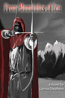
 Despite the fact the overwhelming majority of people liked the revised cover for From Mountains of Ice, in which I addressed the title problem, it would seem there were a couple of dissenting voices. In an attempt to address those issues, I’ve come up with Version 3 of the cover, pictured here.
Your feedback would be greatly appreciated, as it is, after all, you, my followers, who may potentially purchase this new novel, and I want you to like the cover.
If not, well, I’m back to the board again and will attempt to come up with an entirely different concept.
I’ve always loved black, white and red in combo… so that all works for me. (The markings on the face also work for me as tattoos and/or war paint.) What doesn’t work for me is the contrast between the painting and the font of the title. I think the font is too computer-generated. It doesn’t have the same organic feeling as the painting. To put it in terms that I would understand… it’s like plastic lettering on a chocolate cake someone made for me from scratch. I want letters made of icing. (Please.) Aislinn
I’ve always loved black, white and red in combo… so that all works for me. (The markings on the face also work for me as tattoos and/or war paint.) What doesn’t work for me is the contrast between the painting and the font of the title. I think the font is too computer-generated. It doesn’t have the same organic feeling as the painting. To put it in terms that I would understand… it’s like plastic lettering on a chocolate cake someone made from scratch. I want letters made of icing. Please. Aislinn