Cover genesis for Kingmaker’s Sword
There were a few iconic images we wanted to incorporate into the cover, and indeed the series, the primary one being a sword. But not just any sword. According to Ann she was fascinated as a girl by her grandfather’s claymore, “that hung over the fireplace in the living-room when we lived in Manchester,” she says. “It was almost as tall as he was and he was over six feet. But I loved the clean, graceful lines of it.”
The swords in the Rune Blades of Celi are not quite claymores, however. Ann always envisioned them as a hand-and-a-half swords, otherwise known as bastard swords. Kingmaker’s Sword, of the novel by that title, she envisioned as quite simple, with a leather wrapped hilt, and a clear crystal on the pommel.
There are also runes on the blade, which say Take up the Strength of the Celi.
So, we wanted to showcase the sword and create a clean, simple image, with a sense of great portend. Our first incarnation resulted in this:
 |
| Version 1 |
It was decided the cover looked too much like clip-art, self-published, but that the sword and type were acceptable. The runes on the sword are in fact Ogham, created by translating Take up the Strength of the Celi into Scots Gaelic, roughly: gabh ort fh`ein cumhach Celi, and then into Ogham. The type for the title we thought should be in an Old English style, to indicate a medieval-ish reference, and we liked the somewhat metallic feeling of it, to reflect the importance of the sword.
That resulted in this:
 |
| Version 2 |
The type was chiseled in this version, and the purple to orange gradient replaced with a simple black ground. An improvement, but still not quite there. We need a bit more punch. That resulted in our final version:
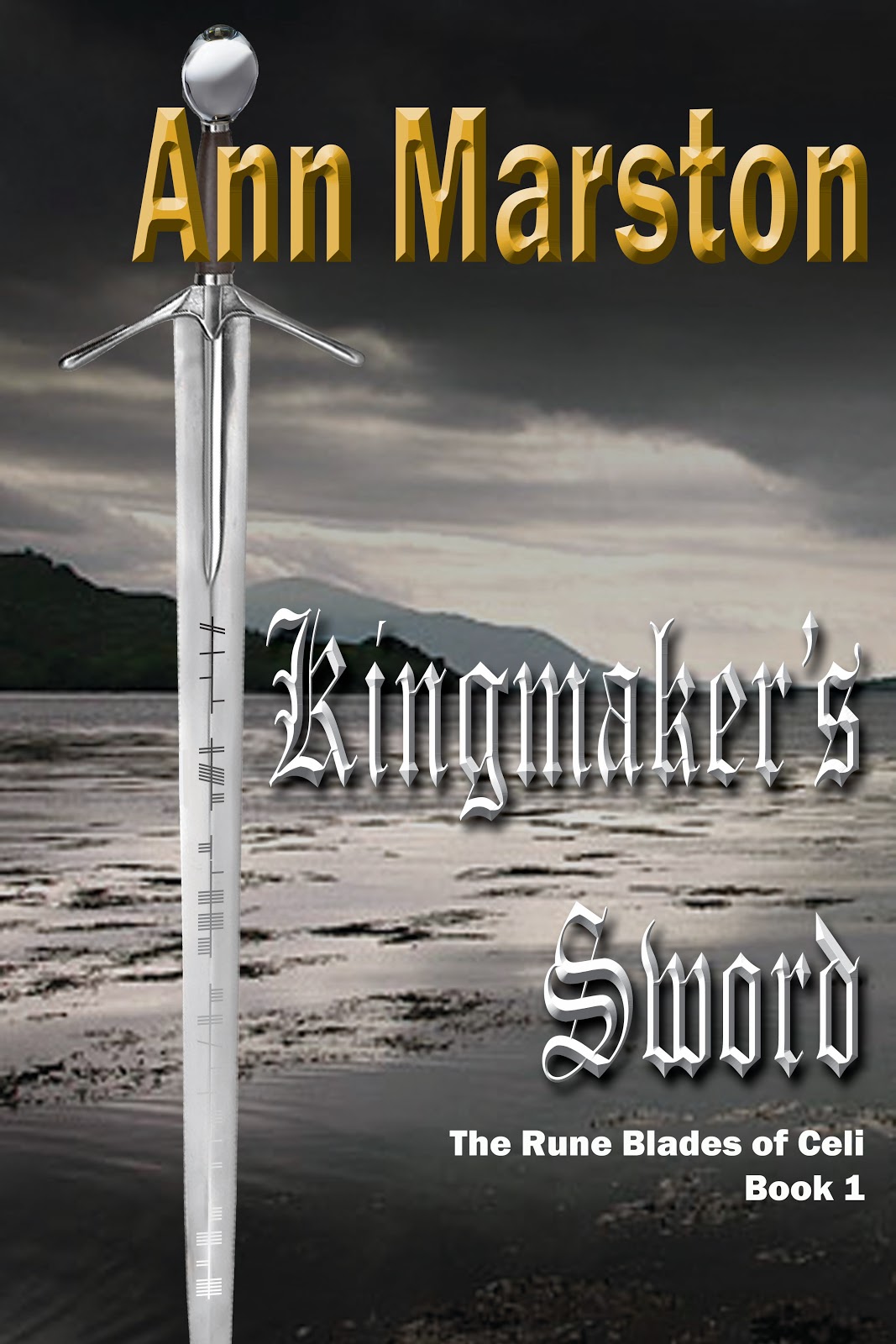 |
| Version 3 |
Now we’re created a sense of place, a definite feeling of brooding storm, and enhanced the metallic feeling of the sword in the sheen of the water and the type.
Update: March 30
Upon consideration, it was decided that in thumbnail size Version 3 didn’t present well. The blackhand typeface for the title was too fine, and the white disappeared. So, we changed the typeface to an uncial, which, as Ann pointed out, is more Celtic, and moved it up to the top of the cover where the lightest light and darkest dark converge, thereby drawing the eye. We moved Ann’s byline down to the bottom, where it is still prominent.
Now, it appears, we have a final cover.
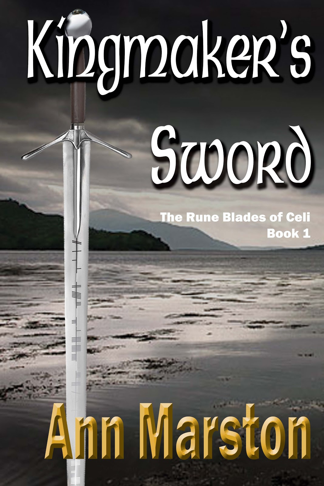 |
| Version 4: Final Cover |