Dutch Schultz: brazen beer baron of New York
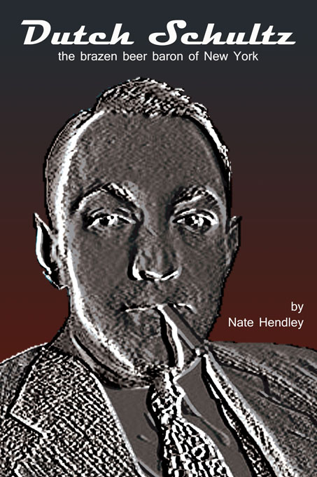
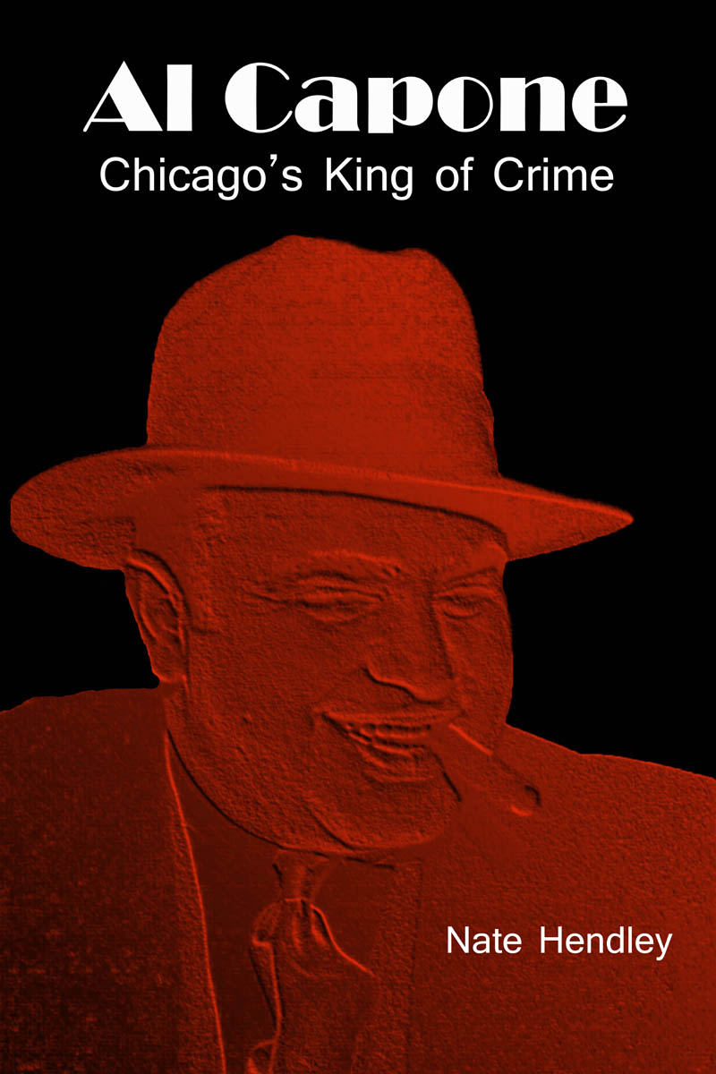
In creating the cover for the Schultz book, we wanted to create a look similar to the Al Capone book, but unique enough that it would stand on its own.
Both covers are the work of Five Rivers’ publisher, Lorina Stephens, who has a background in fine and graphic art, and has designed everything from municipal public transit logos and branding to public awareness posters for social service providers.
Colour was the first consideration in designing the Schultz and Capone covers, and so the palette was limited to scales of black, red and white — very dramatic, very sharp, and edgy enough to mirror the violent subject matter. Both portraits were rendered in an embossed effect to enhance the iconic stature of these legendary figures, and to create an unearthly, even demonic overtone.
Lorina chose to keep the backgrounds very simple, in order to give presence and scope to the portraits. That allowed a saturated ground on which to lay in titling in stark white that leaps off the screen or page, whether in full colour or black and white, and easily broadcasts.
Typefaces were another consideration. It was important to reflect the stylistic trends of the 1930s, the era of the two mobsters in question. Magneto was chosen for the title of the Schultz book. Although a modern typeface, (created in the 1990s) the designer very much relied upon the script styles of the 1930s through 1950s. Frigidaire was the most recognized trade name associated with this style of typeface.
For the Al Capone book, Lorina chose to use the Broadway typeface which was created during the Art Deco era.
Both Dutch Schultz and Al Capone are available in print and digital formats, available now through Smashwords and Barnes and Noble, and coming soon to Amazon and other digital and print booksellers globally. You can also order directly from Five Rivers.

