Genesis of a cover
We thought we’d share some insight today on the genesis of a cover here at Five Rivers; that is, the process through which we take a design idea. In this instance the subject is Simon Rose’s upcoming YA novel, The Insistence of Memory.
The story is targeted for the 14 to 16 age group, an action-packed speculative fiction starting in present day Canada and ending up in the dark machinations of the Cold War Era between the US and Soviet Union.
Lots of kids have an imaginary friend. Max, our erstwhile hero, certainly did. Max’s imaginary friend was a little boy who liked all the things Max did, enjoyed the same games, and who even looked a little like him. Then one day, Max’s friend said something that scared him. Max never saw his friend again. Until years later, Max’s childhood friend returns, older, wiser and disturbingly real. He tells Max of events hidden for a quarter century, events that someone will go to deadly lengths to keep that way. Max discovers that he is the reincarnation of a boy called David who was murdered years before. To save David, Max must journey into his own previous life, not knowing how his actions will affect what he knows as reality.
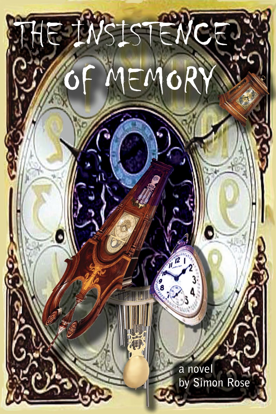
 So, how to design a cover that would capture the essence of the story, tell its own visual tale? At first we went for the obvious, the concept of Max and David fading into and out of time. To the left is our first cover incarnation.
 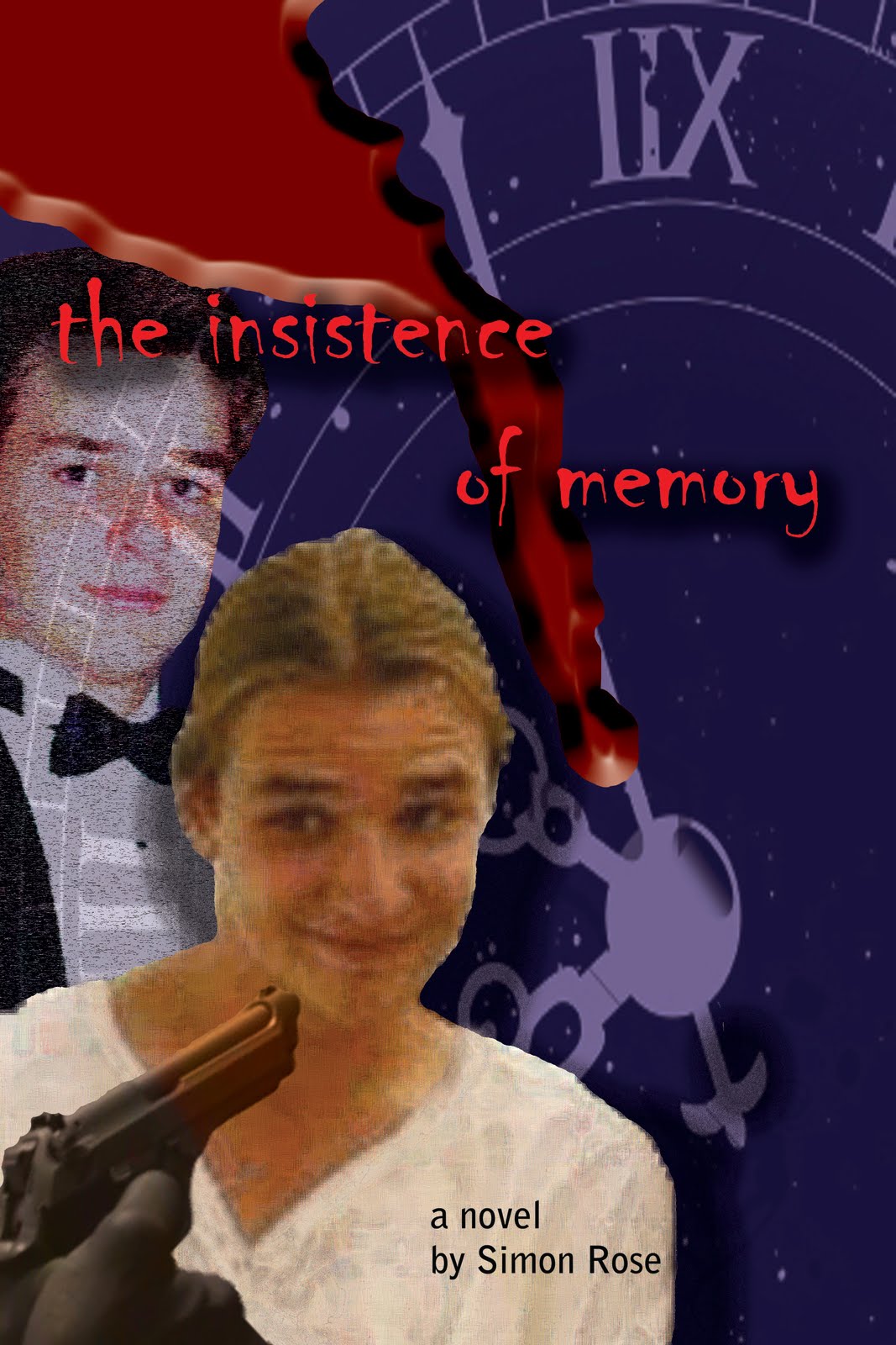 In this case the questions were manifold. Why was the character smiling? Few seemed to get that the smile was more a ‘What the …?’ expression. And the androgyny of the foreground figure became quite a contentious issue. It should be noted the foreground figure is in fact an adolescent male, most definitely an adolescent male. And the blood, well, that just met with thumbs down all around.