Ann Crowe discusses creative process for Avians cover
Cover artist, Ann Crowe, shared with us the creative process behind Timothy Gwyn’s dynamic new YA fantasy, Avians.
I’ve always wanted to do illustration for books, be they book covers or children’s picture books or otherwise, so when I was approached to illustrate the cover for Avians, I was ecstatic. This project was a dream come true for me. After being introduced to the author, Timothy Gwyn, my first order of business was to find out what it was about my style he was attracted to, what scene we were going to focus on for the cover, and then get right in to read the book and understand the world.
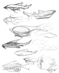
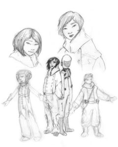
Let me just say, it was a great read! The world was well-built, believable, and I found it easy to imagine the characters and their respective personalities. I was so excited about the story that I had started sketching out the characters and researching the props to be used in the cover scene even before I was finished reading it.
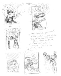
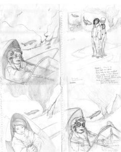
When I was done reading the book and collecting research sketches, I compiled what I had into a few very rough layouts that I showed to the author, Tim. After choosing what we felt was the strongest layout, I cleaned it up, inked it, and added colour. Now, let me tell you, the best laid plans don’t always go the way you wish. My original plan had been to ink by hand and colour digitally (on my computer); what I hadn’t expected was my computer breaking down! So I rolled with the punches and did the colour with traditional medium; however, when I showed the finished piece to the art director, Jeff, and asked for his opinion, I did not get the Wow reaction I wanted.
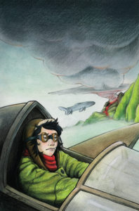
Like anything you put a lot of effort into, when you don’t get the reaction you are looking for, it can be very disappointing and a little disheartening. Instead of letting it get me down, though, I had a good, long discussion about what was weak with the image and considered how to fix it. Then I doubled my effort to fix the problem with my computer, re-inked the piece, and did the colour digitally, this time incorporating what Jeff and I had discussed. In the end I’m glad the first version failed, because it allowed me to create a much stronger piece that I am really proud of.
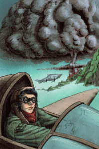
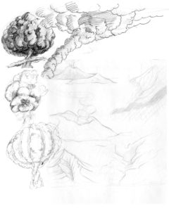
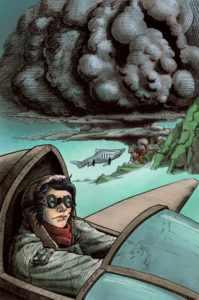
After submitting the final piece, Tim realized the volcanic plume read a little too much like a nuclear explosion, which didn’t fit the story. Armed with this new perspective, I went back to the computer and made a few last-minute edits to the plume. Trying to make the digital overlay match the traditional inks was a challenge, but I was successful and learned a few new things in the process (which is always a bonus).
Overall I really enjoyed working on this cover, and am already making plans on how to improve my skills to suit this style of illustration in the future. I hope you enjoy the book as much as I did!
Awesome! Very nice job Ann, proud of you for not letting yourself get down and learning from the whole experience!
As soon as I saw Ann’s style, I knew Five Rivers had found the right artist. It’s rare for a cover artist to read the entire book, so Ann’s enthusiasm for Avians was a delight. I’m stoked to show the book around and her cover gets great responses. As a bonus, a character sketch she did of Raisa and Mel was so spot on that I begged to have it inside the book. Wish granted!
What a great look at design work and artistry- I feel like I’ve learned something also out of her commentary! Great job Ann!!! Very well done!