James Beveridge talks about creative process for Eocene Station
As soon as I heard that this cover was for a Dave Duncan story, my mind went to the covers that he’s had on earlier novels. My memory sees them as having a classic feel. The story was described initially as a time travel romp, and the title placed much of the story in the Eocene Period. I knew that it was going to be a fun place to visually explore.
Once I’d read the first chapters, I knew it was something special. The future was wild and unique. I knew right away Gastornis was going to have a place on the cover. I could tell from Dave’s writing that he also found the creatures fascinating. Well, needless to say, my inner geek woke up to the chance to work with such a prehistoric predator. Gastornis isn’t your usual feathered, flightless raptor hunter. I did a few studies of gastornis to get to know him structurally, and work out a face there. Cruising through images online, many of which I remember from my father’s big book of prehistoric life, had me spellbound for hours growing up. You know the book, the one with the 3- and 4-panel foldouts of magnificently detailed reptiles, fish, insects and flora-filled environments. It was a gas to bring these wonderful scenes that I fondly remembered from my childhood back into my present.
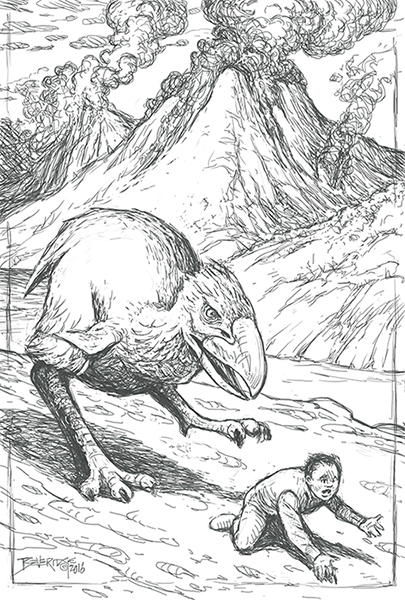
In the beginning of the story, though, there was a description of a holographic display of an event where one of the beasts was threatening a child. I knew that it wasn’t the type of image that would make a cover, and the intrepid author felt the same way, but I had to see how it might look, which would allow me to envision how threatening a gastornis could be, as well as give me a perspective on a potential size ratio for the predator to human prey. Of course the scene needed volcanoes.
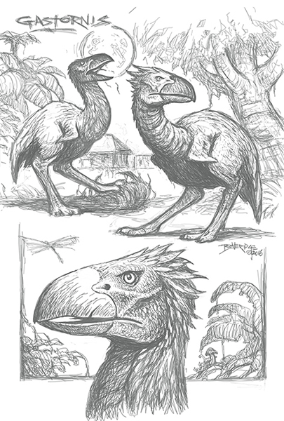
Dave’s descriptions of Eocene Station and its surroundings were inspiring. The buildings were not what one might expect from the standard idea of a base station. The structures were frugal yet practical. The idea of an impenetrable jungle enveloping the station was intriguing.
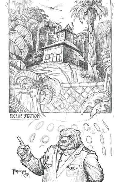
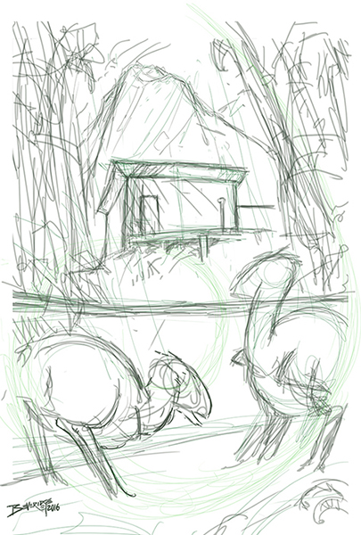
The first sketch was just a single building, and though they were described as single story edifices, I went with a storied office type, with environmental sensors, and storage tanks on top, as the buildings were flat-roofed, hoping that there might be such edifices.
The book opens with a very interesting meeting, where one is a mysterious human hologram in military attire, yet disguised with a fully-animated bear head avatar, totally cool. That’s the fellow seen at the bottom as he might appear in a projector. Lots of fun things to draw in this story!
I thought to try a cover style layout of a classic landscape with a couple of gastornis looking menacingly over the chain link fence. I went with a multi-story building and cliffs to make the jungle appear even more impenetrable. I had fun with the cheap pressboard look. The single taller 3-level building was also more extrapolation, but I really wanted to see it in colour. I figured that I could remove floors later if I had to, without too much fuss. With the denser and more humid air, I went with an atmospheric approach to the scene. I liked the idea that perhaps the moisture laden tropical air would allow shadows beneath small cumulus clouds. In the colour version, I had some fun adding the bug and the carcass even though the bloodied fur and bones were probably a bit too much for a cover.
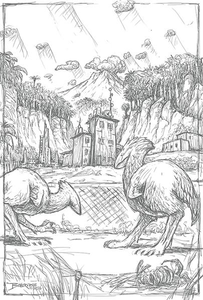
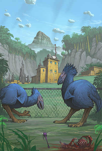
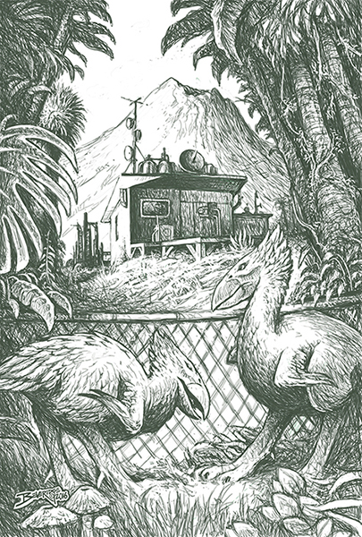
After playing with the new scene, I read more of the novel and couldn’t find any buildings that were more than one story, so I started to reimagine the structures. After wandering around the station in my mind, I pictured, still with the large avain beasts involved, looking through an opening in the jungle from behind one of the shacks. I brought the jungle in as looming dense shapes around the gastornis as they ready themselves to enter the compound, perhaps over the fence.
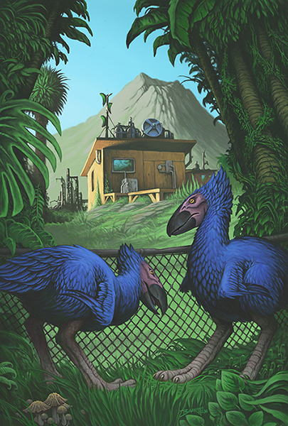
I also thought that we should see into what would essentially be a backyard. I wanted to give the composition a bit of a lyrical sweep with the elements in the foreground, but not too drastic, as I wanted to maintain a slight early SF, retro feel to the scene. The housing compound of the camp was described as open to a beach towards the west, where the residents would recreate, boating and swimming. I thought a late afternoon sun reflecting off the sea and striking the building, while the foreground with the wildlife was darker would add a nice contrast to the setting.
Dave liked the single-story building better, and made sure that I had the fence details in the right proportion to the critters. After that, all that I had to do then was dive enthusiastically into detailing everything, while trying to keep the right depth and atmosphere. I wanted it to seem inviting yet other-worldly, as time travel to an earlier epoch would appear. The one thing Dave impressed upon me, and what I also wanted to include, was the glassy stare of the gastornis’ “deadly-looking yellow eyes”. So, that were the crowning touch.
This was a wonderfully fun project, and I hope that this helps reveal my creative process, perhaps make it seem a bit interesting.
These last three pictures show how I developed the final scene from a quick thumbnail sketch to the final look.
Eocene Station is now available for pre-order.